
First of all, let’s introduce what a reptile is.
What are reptiles?
A web crawler is a program, mainly used for search engines. It reads all the content and links of a website, builds relevant full-text indexes into the database, and then jumps to another website. It looks like a big spider.
When people search for keywords on the Internet (such as Google), they actually compare the content in the database to find out the ones that match the user. The quality of the web crawler program determines the capabilities of the search engine. It is better than Baidu because its web crawler program is efficient and its programming structure is good. You can understand crawlers in such a simple way. That is, a process of requesting a website and extracting the data you need. As for how to climb and how to climb, it will be the content of learning later, so there is no need to delve into it for the time being. Through our program, we can send requests to the server instead of us, and then download large amounts of data in batches.
Let’s take a look at the basic process of crawlers.
The basic process of crawlers
Initiate a request: initiate a request to the server through the url, and the request can contain additional header information.
Get the response content: If the server responds normally, we will receive a response, which is the content of the webpage we requested, which may contain HTML, Json string or binary data (video, picture), etc.
Parsed content: If it is HTML code, it can be parsed with a web page parser. If it is Json data, it can be converted into a Json object for parsing. If it is binary data, it can be saved to a file for further processing.
Save data: It can be saved to local files or to databases (MySQL, Redis, Mongodb, etc.)
After understanding the basic content above, we will deepen our understanding of the concept of reptiles by crawling epidemic data.
send request
Get data Web page source code
Parse the data and filter some of the data I want to use
save data save as table
Do data visualization analysis
The complete code of the crawler
import module
import requests # Third-party modules (send requests)
import re # regular
import json
import csv
1
2
3
4
Then we need to choose our destination URL.
send request
url = ‘https://voice.baidu.com/act/newpneumonia/newpneumonia/?from=osari_aladin_banner’
response = requests. get(url=url, headers=headers)
1
2
retrieve data
data_html = response.text
1
Analytical data
json_str = re.findall(‘”component”:\[(.*)\],’, data_html)[0]
json_dict = json. loads(json_str)
caseList = json_dict[‘caseList’]
for case in caseList:
area = case[‘area’] # province
curConfirm = case[‘curConfirm’] # number of confirmed cases
confirmedRelative = case[‘confirmedRelative’] # new number of people
confirmed = case[‘confirmed’] # Cumulative diagnosis
cruel = case[‘crued’] # Cumulative diagnosis
died = case[‘died’] # Cumulative diagnosis
print(area, curConfirm, confirmedRelative, confirmed, cruel, died)
1
2
3
4
5
6
7
8
9
10
11
save data
with open(‘data.csv’, mode=’a’, encoding=’utf-8′, newline=”) as f:
csv_writer = csv. writer(f)

data visualization
import module
from pyecharts import options as opts
from pyecharts.charts import Map
import pandas as pd
1
2
3
read data
df = pd.read_csv(‘data.csv’, encoding=’utf-8′)
1
data visualization
First, let’s look at the number of confirmed cases in each region.
china_map = (
Map()
.add(“Existing diagnosis”, [list(i) for i in zip(df[‘area’].values.tolist(),df[‘curConfirm’].values.tolist())], “china” )
.set_global_opts(
title_opts=opts.TitleOpts(title=”The number of confirmed cases in each region”),
visualmap_opts=opts.VisualMapOpts(max_=200, is_piecewise=True),
)
)
china_map.render_notebook()
1
2
3
4
5
6
7
8
9
10
Mortality and recovery rates by region
line = (
Line()
.add_xaxis(list(df[‘province’].values))
.add_yaxis(“HealRate”, df[‘healRate’].values.tolist())
.add_yaxis(“dead rate”, df[‘deadRate’].values.tolist())
.set_global_opts(
title_opts=opts.TitleOpts(title=”mortality and cure rate”),
)
)
line. render_notebook()

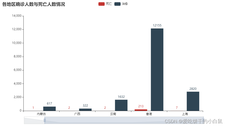
Deaths and recoveries by region
bar = (
bar()
.add_xaxis(list(df[‘province’].values)[:6])
.add_yaxis(“Dead”, df[‘dead’].values.tolist()[:6])
.add_yaxis(“heal”, df[‘heal’].values.tolist()[:6])
.set_global_opts(
title_opts=opts.TitleOpts(title=”The number of confirmed cases and deaths in each region”),
datazoom_opts=[opts.DataZoomOpts()],
)
)
bar. render_notebook()
We finally write a visualized national epidemic map
cofirm, currentCofirm, cured, dead = [], [], [], []
tab = Tab()
_map = (
Map(init_opts=opts. InitOpts(theme=’dark’, width=’1000px’))
.add(“Cumulative number of confirmed cases”, [list(i) for i in zip(df[‘area’].values.tolist(),df[‘confirmed’].values.tolist())], “china” , is_map_symbol_show=False, is_roam=False)
.set_series_opts(label_opts=opts.LabelOpts(is_show=True))
.set_global_opts(
title_opts=opts.TitleOpts(title=”National Coronavirus Epidemic Map”,
),
legend_opts=opts. LegendOpts(is_show=False),
visualmap_opts=opts.VisualMapOpts(is_show=True, max_=1000,
is_piecewise=False,
range_color=[‘#FFFFE0’, ‘#FFA07A’, ‘#CD5C5C’, ‘#8B0000’])
)
)
tab.add(_map, ‘Cumulative diagnosis’)
_map = (
Map(init_opts=opts. InitOpts(theme=’dark’, width=’1000px’))
.add(“Current confirmed number”, [list(i) for i in zip(df[‘area’].values.tolist(),df[‘curConfirm’].values.tolist())], “china” , is_map_symbol_show=False, is_roam=False)
.set_series_opts(label_opts=opts.LabelOpts(is_show=True))
.set_global_opts(
title_opts=opts.TitleOpts(title=”National Coronavirus Epidemic Map”,
),
legend_opts=opts. LegendOpts(is_show=False),
visualmap_opts=opts.VisualMapOpts(is_show=True, max_=100,
is_piecewise=False,
range_color=[‘#FFFFE0’, ‘#FFA07A’, ‘#CD5C5C’, ‘#8B0000’])
)
)
tab.add(_map, ‘current diagnosis’)
_map = (
Map(init_opts=opts. InitOpts(theme=’dark’, width=’1000px’))
.add(“Number of cured people”, [list(i) for i in zip(df[‘area’].values.tolist(),df[‘crued’].values.tolist())], “china”, is_map_symbol_show=False, is_roam=False)
.set_series_opts(label_opts=opts.LabelOpts(is_show=True))
.set_global_opts(
title_opts=opts.TitleOpts(title=”National Coronavirus Epidemic Map”,
),
legend_opts=opts. LegendOpts(is_show=False),
visualmap_opts=opts.VisualMapOpts(is_show=True, max_=1000,
is_piecewise=False,
range_color=[‘#FFFFE0’, ‘green’])
)
)
tab.add(_map, ‘cure’)
_map = (
Map(init_opts=opts. InitOpts(theme=’dark’, width=’1000px’))
.add(“Number of deaths”, [list(i) for i in zip(df[‘area’].values.tolist(),df[‘died’].values.tolist())], “china”, is_map_symbol_show=False, is_roam=False)
.set_series_opts(label_opts=opts.LabelOpts(is_show=True))
.set_global_opts(
title_opts=opts.TitleOpts(title=”National Coronavirus Epidemic Map”,
),
legend_opts=opts. LegendOpts(is_show=False),
visualmap_opts=opts.VisualMapOpts(is_show=True, max_=50,
is_piecewise=False,
range_color=[‘#FFFFE0’, ‘#FFA07A’, ‘#CD5C5C’, ‘#8B0000’])
)
)
tab.add(_map, ‘death’)
tab. render_notebook()